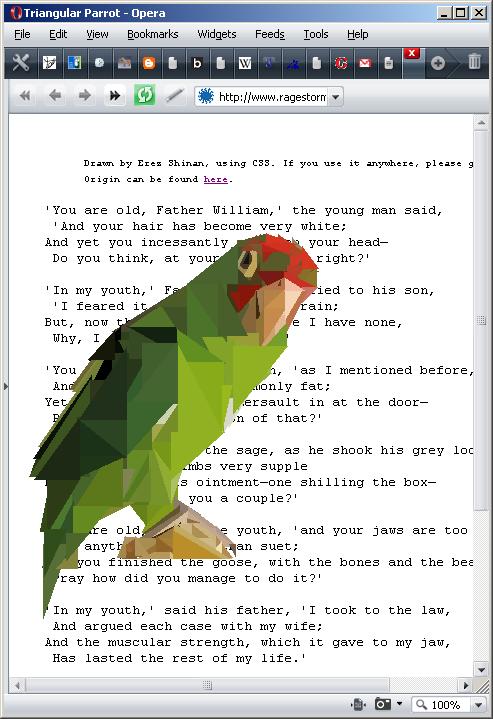
So as I said in the previous post, I've started taking interest in making real drawings using just CSS.
This had led me to create a parrot, which is made purely in CSS. It consists only of axis-aligned right-triangles, and so can be articulated using only DIVs and borders.
And be sure to have a glimpse at the source.
Note it won't work in IE6.0, but should work on any real web browser (IE7, FF2+, Opera, etc.).
Special thanks goes to ragestorm.net for hosting my page (WordPress.com won't allow it). It's also an interesting website for programmers, so check it out.
On Drawing the Parrot
I produced the parrot from this picture.
Drawing the parrot was in many ways a puzzle. Since I could only use axis-aligned right-triangles, I had to figure out how to produce many basic shapes. I tried to keep the count of the triangles low -- I could just as well get a program to produce a pixel-by-pixel copy of the parrot -- but what I wanted was a rough sketch that browsers can download and draw quickly.
The beak was paricularly challenging. I wanted to make a convincing curve, without using too many angles. The lighting on the beak helped me get a good effect with very few triangles (considering).
I had a constant battle between detailing and using few triangles. I used creative superimposing to create several details with the same triangle.
In a "blurry" picture, detail represents focus. I left the origin of the wing undetailed on purpose. I didn't want it to draw attention from what I think are the main features of the image: the face and the tip of the wing (I now regret detailing the stand so much).
What I found curious in the process of drawing it, is that there seemed to be a certain order of drawing which was right to follow. Because it's made of layers on top of layers, the drawing order is affected by the z-placement. In what way - depends on your method. I found it easier -- in the parrot's case -- to draw the top-level triangles first, and background triangles last.
Deciding which details fit in and which don't, was a completely artistic choice. You'll notice the legs are rather blurry in that aspect. In the original image you could see the leg in much more detail, and also a hint of another leg. I thought it's not really relevant to the Big Picture. However, the little yellowish strip on the wing I not only drew, but even emphasized it. I thought it adds realism to an otherwise rather abstract body.
Comments and ideas are welcome.
I'm also planning on making another drawing, so if you have a picture which you think I should reproduce, I'd be happy to consider it.

7 Comments
nice blog compliments
fantastic. it'd be neat to have a tool to convert images to css triangles.
here's a rotating and pulsing star someone made from css borders that amazed me when i saw it four years ago:
http://infimum.dk/HTML/rotatingStar.html
Nice work! As a graphic artist I'm always open to new ideas, and I love to view the work of others. I will be checking back to see what else you've done.
that'S just great ! I'm really sad not to be such an artist with CSS and the whole webbing stuff.
hehehe you're crazy
very nice ! compliments, but how do you find left and top px ?
That's art 🙂